Pekku Coffee
Pekku Coffee is a fictional coffee company based on Mayan Tradition and heritage. I was tasked with designing a logo and mobile application, keeping in mind the core principals of Mayan tradition and culture.
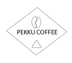
Pekku Logo
Case Study One - Logo
Pekku Coffee is a niche coffee roasting company which specialises in quality roasts using coffee imported from Central & South America and the Caribbean. Much of the green coffee beans sourced by the company are from single-estate plantations and the producers are chosen for their commitment to fairness as employers as well as the quality of the produce.
The company takes its name from ‘Ah Peku’, the Mayan God of Thunder. You have been chosen to design their new logo that will be used for their branding, in particular their web and social media content. The company would like their logo to reflect the quality and care that is taken in the selection and roasting of the beans; their individuality; the diversity of their coffees and the rich heritage of coffee from the Americas.
CREATIVE BRIEF
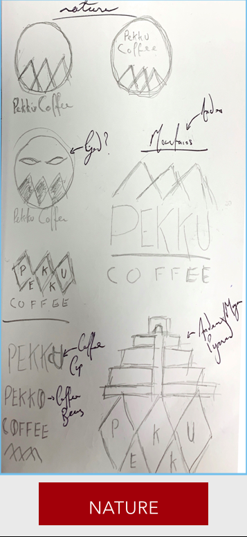
Upon reading the brief, I was instantly struck with the fact that this was a company that cared deeply for it’s culture and heritage along with the quality and care it took into producing coffee
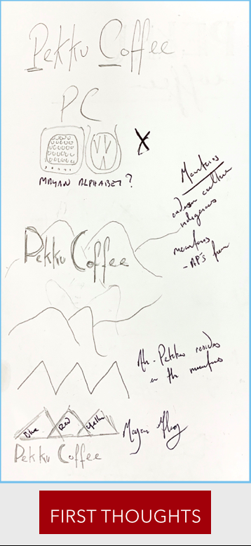
To convey this I did research into Mayan history and discovered that the Mayan temple was symbolic to their culture. I was also intrigued by the Mayan alphabet and my first thought was to design a logo that referenced the hieroglyphs. However, a deeper understanding was required to properly translate the ancient text. Ah-Pekku, the Mayan God of thunder was to also be a vital aspect of the logo, further cementing the Mayan culture.
To convey the quality and fair-trade that was the foundations of Pekku Coffee I wanted to portray the landscape of Maya Mountain Range.
I wanted to the logo to be eye catching, to be representative of Mayan culture and landscape but essentially, I felt that the most important aspect was to convey that was a Coffee Shop, where along with quality, passion and care, one could taste the history of the Mayan Civilisation.
This lead me to sketching a variety of designs that incorporated culture and landscape, all of which would lend themselves, each in their own particular way, to the final logo


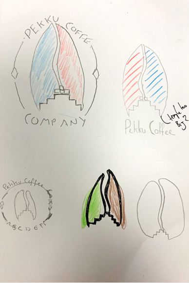
COLOUR CHOICE

Regarding my colour choices, I once again wanted to focus on the richness of Mayan Culture. Further research led me to the Mayan Colours of Humanity (Red, White, Black and Yellow,), the Mayan Flag (White, Blue, Yellow and Red) and the Sacred Mayan Blue. I was drawn to Red, for it represented fire which in turn represents the roasting of coffee beans. In Mayan culture red is also associated with initiation, calmness and positivity. Rather than using a bright and vibrant red colour I dulled it a little so that it had slight brown tones thusly likening it to the deep rich colours associated with coffee.
Mayan blue is unique to Mayan culture and was used in paintings on pottery, in murals and during rituals. I wanted to include this colour in my logo as it is often depicted in text or film on Mayan culture. Being a bright colour it also created contrast and added more depth to the logo.
FONT
I experimented with many different fonts. At first I wanted to try and use fonts that were in keeping with Mayan Culture, I tried using fonts such as Ambages and CF Civilisation Maya. However, I felt that these were not in keeping with my idea for a clean, uncluttered logo.
I then experimented with my own handwriting, keeping it tall thin and modern, similar to the font Abandoned. However, this did not fit with the more heavy shapes within in my logo
I finally decided Acumin Variable Concept. While being clean, legible and balanced, this font is also extremely versatile and performs brilliantly at various display and text sizes.


FINAL THOUGHTS
Upon beginning the process of drawing up my final logo, I had managed to create a list of criteria that I intended to follow.
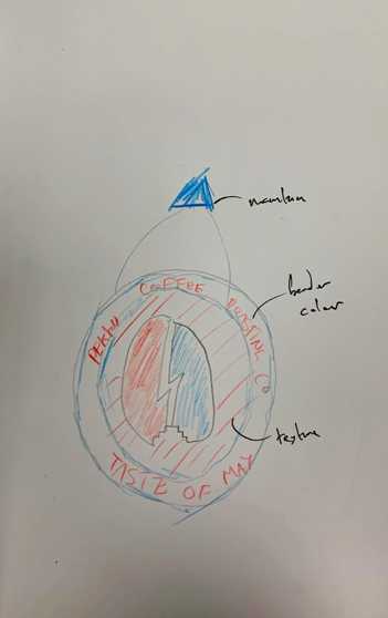
Focusing on sustainability and fair-trade, I wanted to include a natural element to the logo. I decided that this would be the Maya Mountain Range, which incidentally, I also referenced in the tag line.
To incorporate Mayan culture, I decided include a Mayan Temple and also a lightning strike which is symbolic of the Mayan God Ah-Pekku from which the company gets it’s name.
I wanted the logo to be uncluttered and instantly recognisable for what it was - a coffee shop. In-line with this I wanted to keep the colour scheme simple. I experimented with different combinations of colours but eventually decided on Mayan Blue and the Burgundy Red.
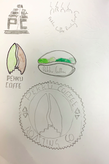
My final sketches included different variants of the central coffee bean and temple, various colours and outlines. But the core idea remained the same throughout and that is what I brought into illustrator.
FINAL SKETCHES
ILLUSTRATOR DESIGNS
Experimenting Using Water Colour Effect To Create a Coffee Stain
Experimenting With Different Shapes & Designs
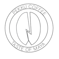
Outline For What Would Become The Basis Of The Final Logo
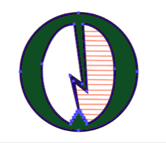
Experimenting With Different Colour Schemes
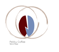
FINAL LOGO
CONCLUSION
My final logo is one that is representative of all aspects of Pekku Coffee Company. It is rich in tradition and heritage borrowing my facets of Mayan Culture.
The design and shape lends itself to classic major coffee company logos and the colours are retro, niche and specific to Mayan heritage.
A lot of emphasis is placed on the central coffee bean which is striking and unique ensuring a customer that this is a company that takes pride in its produce.
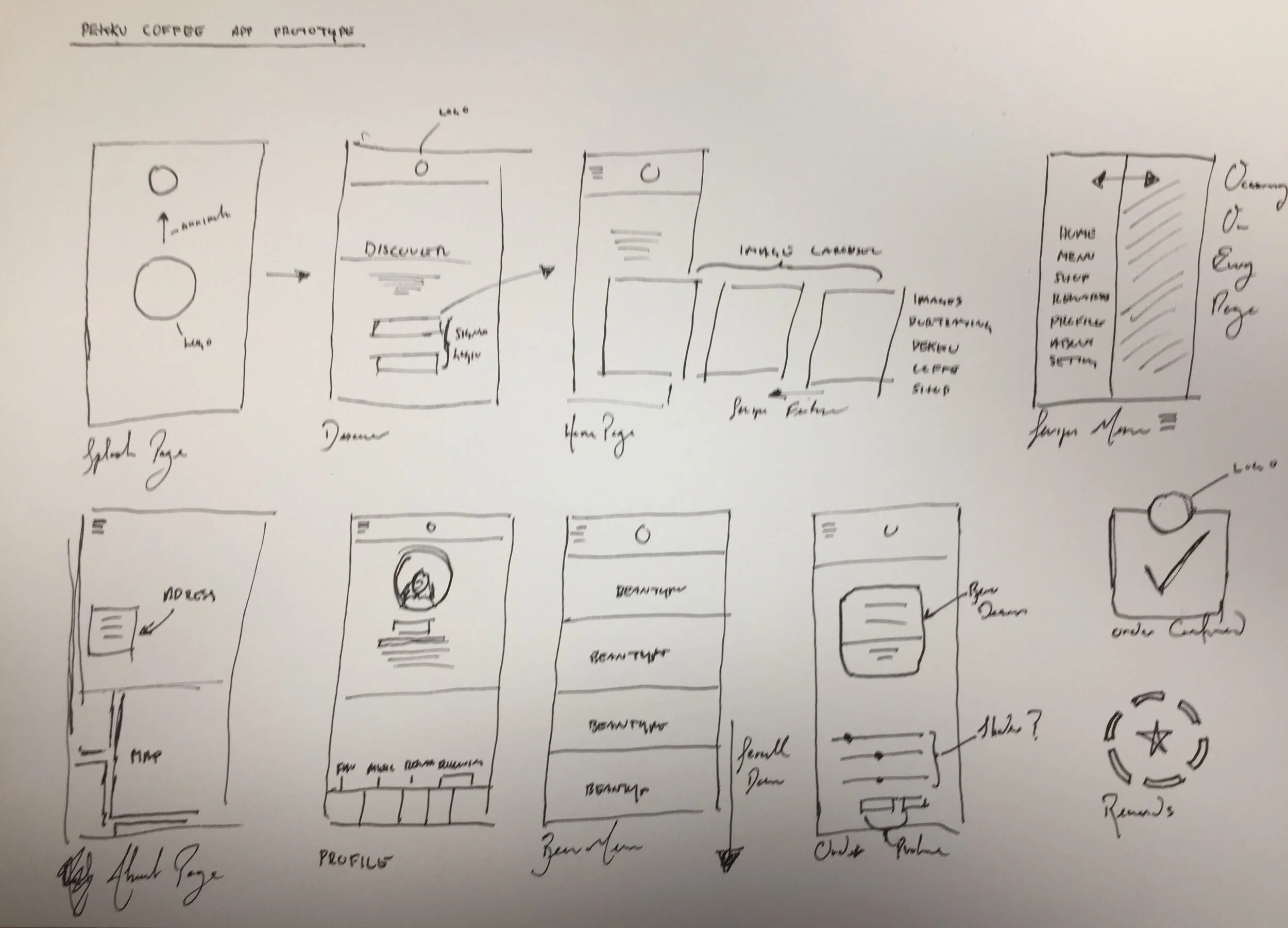
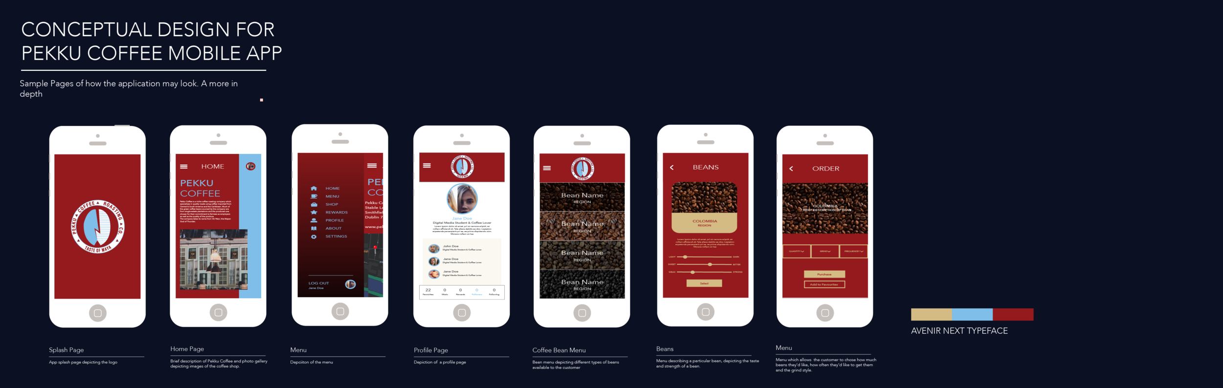
CASE STUDY TWO - MOBILE APP
Pekku Coffee is going to launch an app that will let their customers order and manage their subscriptions on their mobile device. The application is aimed at domestic consumers as opposed to cafés and will serve as an entry to an exciting new market for Pekku. The main functional requirements for the application are:
Facilitate users to set up accounts
Allow them to enter and save their payment credentials
Allow easy browsing of the Pekku Coffee range
Help them learn about the selected coffee
Assist the user in managing their order - e.g. 500g bag every month or 2 weeks